My proposed research question was: “Based on a preliminary review of the 311 data from 2011, it seems there is a fair amount of complaints assigned to the Department of Parks and Recreation. Initially, I believed this would be regarding playground maintenance or smoking violations in parks around the five boroughs, but it seems a lot of the data are relating to trees. I would like to know how many trees in NYC that are reported as needing to be replaced (due to damage, etc) or new tree planting requests are actually fulfilled and also try and see if there’s any discrepancies among the five boroughs (is there a “greener” borough?). I might not be able to completely determine this, as it may take the department longer than the calendar year I am viewing to actually replace it, but I would like to play with the data a bit more to determine this. If I’m not able to determine that, I will analyze the various tree reports that do come in within the calendar year.”
I was not fully able to realize this question because, among other factors, not all of the reports were closed within the calendar year (2011) that I was analyzing, so it was difficult to visualize the data within the one calendar year I wanted to look at. Additionally, I wasn’t entirely able to execute creating a Gantt chart, despite the tutorial (https://onlinehelp.tableau.com/current/pro/desktop/en-us/help.html#buildexamples_gantt.html) that Erin shared with me at the time of my proposal. I followed the directions, but I couldn’t get the data to show up the way I wanted it to. Therefore, I’ve opted to address a different question that I hope will lead me to the ability to discover my larger research question later. The data visualization I’ve created for this assignment shows the number of 311 reports that are assigned to the Department of Parks and Recreation that relate to a damaged tree, dead tree, or a new tree request. My research question at this point is simply to determine the volume of reports within the five boroughs broken down by month. As stated earlier, I wanted to determine if there’s a “greener” borough based on this particular data set. I cannot accurately conclude which borough is the greenest, but I can infer that the boroughs with more reports do have more trees in them, thus making them “greener.”
The audience for this visualization could be the Department of Parks and Recreation in order to make an internal departmental assessment about what kind of reports are coming in regarding trees, but it could also be viewed by the citizens of NYC to see what kind of activity is happening regarding the trees of the city.
I used a bar chart to visualize one year’s worth of 311 data from the NYC Open Data portal. I chose to assess all complaints received by 311 regarding a “Damaged Tree,” a “Dead Tree,” and a “New Tree Request” that were assigned to the NYC Department of Parks and Recreation in 2011. The data is broken up by borough and each borough (arranged alphabetically) has a sub breakdown for each of the complaint types listed above. The x-axis is the twelve months of the year (January to December, 2011). Each of the bar lines within the chart represent the number of complaints for a particular type that came in within any one month of 2011. The wider the width of the marking, the more complaints were received. I used a green color palette to visually represent the three different complaint types.
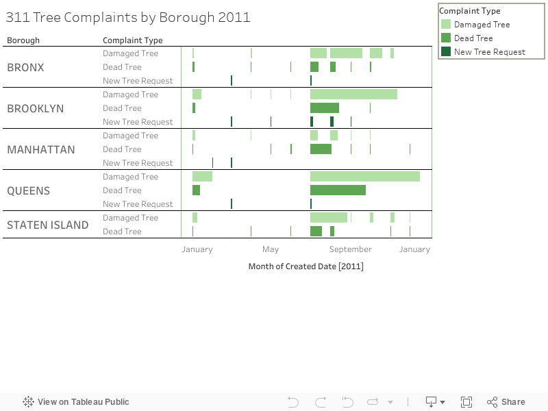
I used a bar chart in my final visualization, but I originally intended to use a Gantt chart to show a relationship between start and end time for the complaint. I was not able to fully execute this, though. I ended up choosing this chart type because it ended up representing a subset of the information I wanted to look at: the volume of complaints in each borough each month for “Damaged Tree,” “Dead Tree,” and “New Tree Request.” The bar chart represented the volume well. However, I am not entirely satisfied with this representation because in spots where there is a lot of activity (i.e. Staten Island Damaged Tree complaints in July) that overlaps with the following month’s data. I am not sure how to fix this. I tried several settings, but could not find the appropriate one. I also attempted to use squares (instead of bars) to demonstrate the volume, but since many reports have a volume of less than 5, they are very small, but there were some dates that had a high volume (up to 169) so the squares didn’t represent the differences the way I wanted them to. Overall, I am satisfied with the overall layout, such as borough and complaint type breakdown and labeling, but I think if I am able to figure out the Gantt chart, it will be even better. Or, if I could determine a different way to illustrate volume of complaints, it might be improved. I also wanted to include the “Resolution” of the complaint and this is included in the tool tip, but when there is more than one complaint within the bar representation, the resolution is not displayed or says * (null). I’m assuming there’s a way to fix this, but I was not sure how to.
I definitely want to build out the start and end information for each of the complaints so that there is some additional temporal element included that could demonstrate the efficiency of the department’s response to these kinds of complaints. I could also include more data from the many years collected through 311. As I’ve made some initial assumptions about the “greenest” borough, I could do some more research on how many trees are counted in each borough. I could also cross reference this data with weather data to see if there’s a correlation with “Damaged Tree” reports and inclement weather that could harm trees. I’m also interested in learning more about the “New Tree Request” and figuring out exactly what this entails and how it is responded to. When is a new tree request filled and why?