White Paper
First of all, I want to say how accomplished I feel after the intense summer course in Data Visualization. In four weeks, I and my fellow classmates were able to become proficient in Tableau and GitHub. I was first introduced to Tableau and GitHub about two years ago during my first semester at the CUNY Graduate Center where I was enrolled in the Introduction to Digital Humanities course required of all first semester students.
The introduction included a one hour workshop on Tableau, which lasted long enough for me to observe that it was a powerful tool I should one day work with, but not long enough to really even get a full tour of the site. Nevertheless, I added it to my list of “tools to master.” My professor, Lisa Rhody, used GitHub for sharing information such as the course syllabus, and encouraged the group I was working with to use it in our project’s development, but again, it was only a cursory introduction and there was no guidance as to how or why it should be used. Mostly, I had enrolled in the MALS DH program to learn new tools that I could employ in my work as a librarian and the first semester provided a smattering of introductions to various DH software, in addition to plenty of theory! I did not take to the theory so quickly at first and was quite restless to get down and dirty with learning new software, but I’ve come to realize, in my two years since commencing the graduate degree, that without the theory, my use of the tools would have very little context or impact.
While working full time, and attending classes part-time, I had not had the opportunity since my first introductions to get to know Tableau or GitHub better (or maybe I didn’t make the time for it), thus when the first MA in DH course of the new program at the Graduate Center was announced, I was excited to enroll. Although summer courses can be intense, the bootcamp nature of this course was really effective. It was truly a pleasure to have Erin Daugherty and Michelle McSweeney as instructors for Visualization and Design: Fundamentals. They promised we would learn a lot and warned that it would be intense, but four weeks later, I am proud to say that they held up both their promise and warning. While I’m not yet a Tableau or GitHub master, I am infinitely more comfortable using both platforms. What follows is a narrative of my experience this summer and description of the process I undertook to create my final visualizations.
As with the first two assignments for the course, I was tasked with making a proposal outlining my research question, audience, the data I would use, and a sketch of the visualization I planned to create. It was due by Friday, 6pm and then I had two days to complete the assignment. I wrote the following:
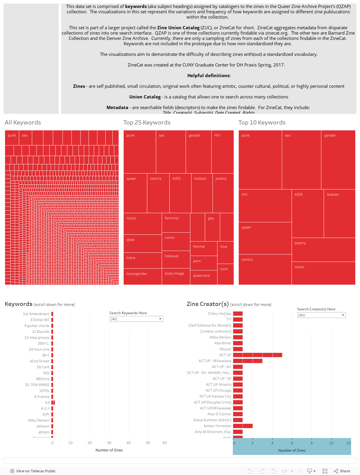
Research question: Jenna Freedman and I have been conducting ongoing work at the GC to develop a Zine Union Catalog that will allow scholars, researchers, zinesters, and anyone else interested in locating zine collections through a single search interface. It is called ZineCat. First, a zine is a self published, small circulation, original work often featuring artistic, counter cultural, political, or highly personal content. Second, if you’re not familiar with a union catalog, it is a catalog that allows one to search across many collections. Libraries across the world have been collecting zines and making them locally findable (i.e. through the institution’s own catalog), but they are rarely made findable via larger union catalogs, a la Worldcat, and often have different means for describing the zines (aka non-standardized metadata).
For our ITP Core II course this past spring, we wrote: “Because zines exist in a counterculture space, they have historically been collected and circulated first by independent collectors, then zine libraries and activist centers, followed later by research institutions. Over the last fifteen to twenty years, public libraries, special collections, and academic research libraries have begun collecting zines as scholarly resources, as well as part of leisure reading collections. This hybrid environment of zine collections translates into dispersed and sometimes erratic mechanisms for access (not all libraries describe material in the same, standardized way). Zine descriptions and metadata, thus discovery of zines, are scattered across library catalogs, archival finding aids, standalone databases, spreadsheets, and online platforms such as LibraryThing. This diversity of access points poses impediments to finding and using zines in aggregate for research, teaching, and learning in the humanities. The Zine Union Catalog (ZUC) seeks to federate metadata from these disparate sources.” (Full paper linked here.)
Since there is a discrepancy in describing zines, I would like to analyze two fields of the zine collections we have in ZineCat: creator (aka author) and keywords (aka subject headings). When we launched ZineCat in spring, 2017, we did not include keywords as they presented a challenge for our system, but they are a very essential part of how users will search for, and find, the zines in the union catalog. At this moment, my research question is: How can visualizations assist me in discovering the inconsistencies and impediments of describing the zine collections in The Zine Union Catalog (ZUC)? With new discoveries through visualizations, how can the metadata for organizing zines be improved (and/or standardized) to make finding zines through ZUC easier?
Audience: The immediate audience for this project is me and Jenna Freedman, along with any other members of the zine union catalog community. However, this project has a larger audience in the wider zine community and will reach any individual or group that ends up using the Zine Union Catalog (including students, scholars, researchers, librarians, zinesters, catalogers, etc.). The data: I will use a sampling of data from the three institutions that are currently represented in the Zine Union Catalog: Barnard Zine Library, Denver Zine Library, and the Queer Zine Archive Project (QZAP). Stored in the xZINECOREx Github repository are samplings of records the three collections. I’ve identified QZAP’s data set to be the “easiest” to use as it will require the least amount of cleaning (so it’s possible I will just use this set), but ideally, I would like to have all three collections that are currently visible in ZUC to be represented in my visualizations. In the ZUC, there are about 20 items from each collection, so I may pull out the information on those items specifically for the visualization or I may just use QZAP’s data.
The sketch: I’m not quite sure at all how I want to sketch this out. I feel like three weeks in I should know about what type of visualization I want to make, but I don’t think I’ll really know until I start playing with the data. I hope that’s okay! Nonetheless, I am including a sketch based on preliminary thoughts I have about the data I’ll be analyzing and the questions I have, but it is for sure going to change!
The Process: I didn’t begin to work with my data until Saturday afternoon where I first assessed my data options. As I stated in my proposal, ideally, I wanted to incorporate data from the three collections findable in the Zine Union Catalog: Barnard Zine Archives, Denver Zine Library, and QZAP. I started out with QZAP and created several visualizations, but then I imported all three into Tableau, but really couldn’t work out a way to join them successfully. I didn’t want to spend too much time massaging this data, so I quickly decided to only use an Excel spreadsheet from GitHub that contained the Queer Zine Archive Project’s (QZAP) collection information. Some early notes I have are:
- Attempting to combine two sheets or more proves difficult
- Going to start with QZAP data first.
- QZAP: what fields to I want?
- Zine Creator
- Keywords
- Dropped all keyword dimensions on Tableau label and # of records on size
- Cleaning data → restructure the data?
At this point, with Jenna Freedman’s (colleague and classmate) advice, I selected all keyword dimensions that were stored in many many columns of the Excel file and pivoted the data so that it became long and skinny data. With this “new” data I started to play around in Tableau with different chart types. I created:
- Bar charts
- Tree maps
- Clusters
- Pie charts
- Word clouds
With advice from the instructors I focused the early part of my exploration on really looking at what information the bar chart could provide. With my recently acquired Tableau skills, it was easy to get carried away and want to make really fancy charts and visualizations, but they suggested I simply start with a bar chart.
With that in mind, the two bar charts I created were all the keywords used in the set and how often. The other chart was of zine creators and the number they had created. Both charts are VERY long and require a lot of scrolling, however, within the first bar chart, within the first few keywords listed (alphabetically), I could see that there were three ways that an organization was spelled: “ACT-UP,” “ACT UP,” and “ACTUP.” I also noticed that “Adbusters” and “adbusters” were listed separately. With this early observation, I decided to leave the visualization alphabetized (instead of ranking it from lowest to highest frequency or vice versa), because variations in spelling of the keywords would be an easy way to determine an issue with the keywords set. As my research question indicated, I wanted to visualize the “problems” of the messy data, and within my first simple visualization, I was able to demonstrate that spelling variation creates multiple keywords that are essentially trying to describe a zine in the same way.
After noticing some keyword spelling discrepancies, I wanted to make the tooltip provide more information about the data, so I added Zine Title to the tooltip in the worksheet. When there was a keyword that had been applied to more than one zine, the tooltip would show an asterisk (null value). I remembered addressing this issue in a previous class, but could not quite remember how Erin had guided the class to fixing it. I then googled for the answer. Browsing through a few sites, I finally found the answer: Zine Title needed to be added to the Details card as well in order to show multiple values in the tool tip. Huzzah! Success on getting the details I wanted into the visualization.
Around this time, I have a note that says: “Look into why tabs show on Jenna’s visualizations embedded in GitHub” and not mine.” The tab function allows the embedded image to show all the worksheets in one screen, as opposed to scrolling down to the bottom of Tableau Public and clicking a link to the particular worksheet. While I didn’t get the answer on Saturday, Erin was able to explain on Monday that it is a setting in Tableau Public’s online platform. I have a note to follow up on looking into that setting, but we were cautioned to use the tab function with reason! [insert image of tab no tab here]
After success with Bar Charts as visualizations of my data, I wanted to try out Tree Maps with the keywords. This created an incredible visualization that demonstrated how nuanced the keyword description of zines is in this set. There were a few keywords that had been used more than once, but the vast majority of the terms in the set had only been used once, which provided a striking visualization. I then wanted to somewhat experiment with small multiples, even though what resulted was not necessarily “small multiples.” I created two more tree maps: 25 top keywords and top 10 keywords.
At this point, I felt that I had gotten a good set of visualizations for the QZAP set, but I quickly revisited the Zine Creator chart. I have a note that states: “realized that pivoting data is falsely applying # of records!!” I decided that I would seek help in class with fixing this (which was accomplished during the workshopping day that was set aside for the class).
As I had been working with the one set of data for a few hours, I decided to go back to the set of data that brought in all three collections and reassess how difficult it would be to incorporate data from the Barnard Zine Library and Denver Zine Library. As earlier in the afternoon, I couldn’t get the data to join instantly and didn’t want to spend too much time incorporating more data that would change my visualizations created thus far so drastically, so after 30 minutes of attempting to join the data, I “killed that darling” and moved on to fine tuning the QZAP data visualizations.
Most specifically, I focused on the aesthetic look of the visualizations and tried to incorporate the color scheme used in the Zine Union Catalog: black and red. During the draft phase, I changed all the tree maps to a dark, light, and lighter variation of red and also left the zine creator bar chart as all red. With the keyword bar chart, I chose the color blind color theme in Tableau, but I really was not happy with that choice. Nevertheless, I left it in for the pin-up phase of the project.
The pin-up process throughout the semester was very helpful to get insight in other’s view of the visualized data and this silent pin-up (where we weren’t allowed to defend our decisions until the class and instructors had provided their feedback) was especially useful in updating the draft and finalizing the visualizations. Some notes I have from this part of the project are:
- Dashboards can be duplicated, too, so don’t edit the draft dashboard, but create a new one and work from there.
- Adding tabs in the visualization should be a conscious decision the visualization creator employs and there should be a legitimate reason to provide the visualization that way.
- Change the treemaps font color to black and standardize the red shading of each of the maps (I left the font color white).
- Incorporate dashboard actions (I had forgotten how to do this between class time and draft creation, but Erin walked me through it during workshop day).
- Add a text box at the bottom of the viz to sum things up?? (I did not end up doing this and instead updated the text box explaining the project at the top of the visualization.)
I have separate notes from the group’s feedback:
- The background of the text box is too bold, consider using a different color
- The tree maps should come before the bar charts order them: 10, 25, all. Flip visualizations
- Use the dashboard actions to highlight information in the visualizations
- Make tree map segments the same size (⅓ of the width for each)
- Make the tree maps the same color
- The keywords bar chart is not visually aligned with the rest of the aesthetic and is not immediately intuitive that one has to scroll down to see more keywords. Add that to the title.
- Improve the tool tip for the tree maps
- Make both bar charts scroll in the same direction (up and down)
- Sort the bar charts biggest to smallest, but there was also an observation that the alphabetical default might have been left for a reason (I silently nodded emphatically in agreement with the second observation)
- Shows the chaos
- Use dashboard action to break out zine creator and keywords? (Not sure I fully understood what this meant and when I asked for clarification the next day, commentator couldn’t remember, so it was ignored).
- Add a wildcard search within visualization.
- Change label colors
This project was the only visualization we were required to update after receiving feedback and I found it to be really helpful to have many more sets of eyes critique the project. The next day in class was a technical workshop where I drafted the following questions/goals for updating the visualization:
- Update the data so that Zine Creator chart is not misrepresenting the number of zines. (I worked with Erin on describing how I had pivoted that data and she worked with me on cleaning up the visualization so that it was more accurately representing the correct number of zines created by any one person/group.)
- Format the legend for keyword bar chart. (I was frustratingly trying to change the color coding label and Erin directed me to inserting a key which I was then able to change so that it was a drop down/searchable key for keywords. I applied the same key to the zine creator visualization and added them to the dashboard).
- I wanted to add total numbers to the bar chart in both visualizations, but due to the way I pivoted the data, and created the visualizations, it did not work properly, so I “killed that darling.”
- How do I improve tooltip for tree? (Change the tooltip to a sentence which was easy enough to accomplish.)
- Dashboard actions (worked with Erin to add highlights for tree maps and bar charts).
- Add a visible URL to the bottom of the dashboard? (Killed this darling)
- Changed the color of the keywords bar chart. (I made all five visualizations the same color red and also changed the introductory text background to grey. MUCH better looking!)
After the workshop session, I made a few more notes of things I wanted to finish working on: fix tooltips, bold the labels on dashboard view, fix the sizing and layout of the visualizations and its embedding size. These were all accomplished by the day of final presentations (except I realized one of the tooltips did not get updated).
My final visualization can be seen below:
In case the visualization does not appear above, please click this link to visit my Tableau page.
I know part of this reflection is to incorporate the readings, but I unfortunately did not have much time in this intensive course to reflect deeply and do a deep reading of the selections. I am excited to revisit them upon completions of this paper when I do have a bit more free time. Nonetheless, some of the readings I did appreciate really dealt with how to tell a good story and how to sketch visualizations out. Dear Data was very influential in helping me take a step back to realize even though Tableau is an amazing tool that creates wonderful visualizations, there is still opportunity to incorporate drawing and drafting into the planning and preparation of visualizations. During the course of this semester, I lead a workshop with librarian colleagues on lesson planning design and I was inspired by the sketching we had been doing in class and brought markers, paper, post its, and other manipulative so that the group could draw things out (if they chose to). I think that this process of drawing things out will influence other work that I do going forward, not just the creation of visualizations (although I will employ it there, too).
I was also quite inspired by the David McCandless TED Talk and appreciated how approachable he made working with big data sets and shared his philosophy for data design. I visited his website and there was a three minute video on how he and his team work together, and it made me appreciate how this course was set up so that we individually worked and then came together to workshop and collaborate.
One other skill I am walking away with this semester, in addition to Tableau and Github, is a method for storyboarding. I don’t have an opportunity in much of the work that I do to storyboard things, but I really enjoyed the process and discussion afterwards on how to best tell a story with visualizations. Much like the sketching, storyboarding offers another approach to thinking about the work I’m doing.
Finally, I want to say how appreciative I am for the whole set up of this course. There was plenty of critical theory incorporated and immediate practical tool application. This is very much what I was hoping most of my courses at the Graduate Center would allow for. I will make this suggestion to Matt Gold that equal parts theory and practical skill building are employed in the classroom. Thank you both for a wonderful and intense semester.